There are some websites out there that offer great products and others which are for an extremely worthwhile cause, but no matter how outstanding the organisation is, without an equally outstanding website and marketing, you’re never going to be a success online. We believe our ongoing relationship and recent work with Acorns Children’s Hospice is a great story – and one we would like to share.
Our history with Acorns Children’s Hospice
Acorns Children’s Hospice is one of the most prominent charities in the Midlands carrying out vital work for life limited, life threatened very sick children, young people and their families.
How our relationship with Acorns started
Five years ago we were approached by Birmingham based creative agency, WM Creative to work with them on the development of an open source website for Acorns (www.acorns.org.uk).
Drupal was initially put forward as the solution of preference but having previously had poor experiences with Drupal we suggested that the open source CMS platform Joomla. Back in 2010 when we were approached these were the main two CMS contenders in the open source space but we felt that Joomla’s architecture and modular design was far better suited to the project.
Working with WM Creative and Acorns, the complex development project took place over a 12 week period. The job was completed on time and the website delivered a huge improvement over the previous bespoke solution, which both WM Creative and Acorns felt was limited in its content management capabilities and potential for enhancements.
Fast forward five years…
Fast forward five years and a lot has changed in the world of web design and this is reflected in the open source platforms, components and solutions available. Back in 2010 when we reviewed the options for Acorns, WordPress was available but was largely considered as blogging platform and offered little in comparison to the content management capabilities of Joomla.
However with the technical advancements made to the core platform and developments by the wider community, that’s all changed now. The beauty of open source is that developers all around the world are constantly pushing the boundaries of what’s possible, contributing new ideas, collaborating on projects and releasing new plugins/extensions/themes etc, rather than trying to reinvent the wheel.
Today, you can find some of the best third-party plugins and themes available in the open source market place available for use with WordPress.
The challenge
The solution which had been initially developed for Acorns using Joomla had become out-of-date, with different components added over time to meet individual requirements.
Lack of focus
The site stretched across so many different services, there was no clear focus and the website was no longer representative of what Acorns had to offer or was trying to achieve.
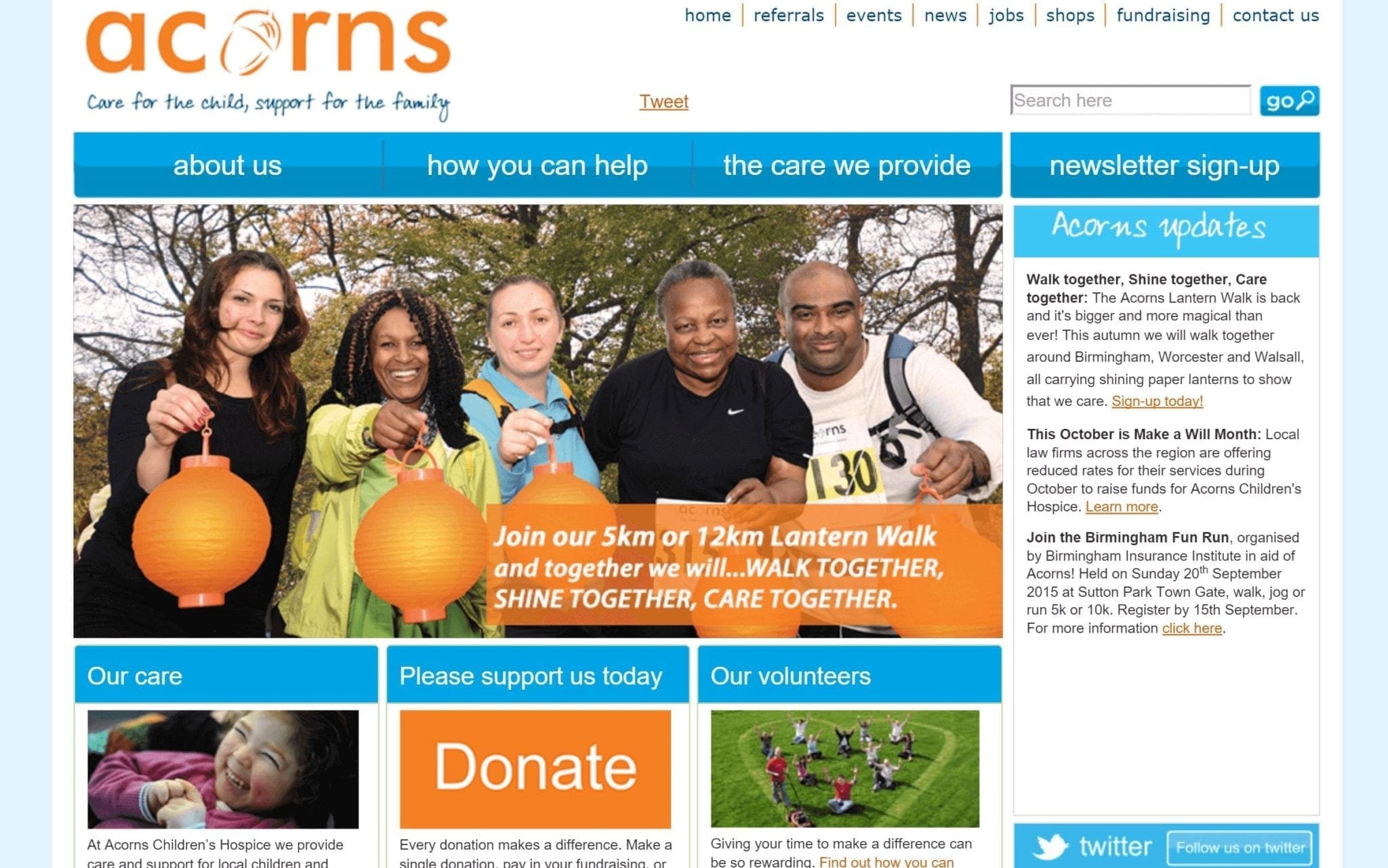
Acorns Joomla based website design
Due to the piecemeal approach to development over the years, the website wasn’t as dynamic or flexible as it could have been, denying the chance to adapt the website to the needs of the business or audience. This combined with technological advancements and changes in user expectations (e.g. a mobile friendly experience) meant that the website was in desperate need of a refresh and bringing up to modern standards.
Out-of-date technology and design
Technology has changed a lot in five years and this was arguably something that needed to be considered during the planning stage. A growing number of people no longer access the internet through traditional means, preferring instead to browse while on the go, or even at bedtime! This meant that having a website which was optimised not just for desktop browsers but also for mobiles, tablets and other smaller devices was critical.
It was time to take a long hard look at what was needed and break down the task into bite-sized functions which could be tackled.
The objectives
With a long history of working with Acorns we had a good understanding of their challenges and what they were trying to achieve. We always try to get to the very heart of our clients so we can adopt the same ethics and outlook. With Acorns this was easy as they had done a lot of work in outlining the objectives and reviewing/agreeing these with us. The initial set of objectives were to:
- Make website work a lot harder, generating leads, pointing people to right areas of the site and generating donations
- Maintain and improve customer service and organisational/corporate information
- Use latest web design standards and practices (mobile friendly/responsive)
- Find more effective ways and greater opportunities of capturing data
- Calculate ROI and web page value
- Deliver a greater focus on lead acquisition feeding to all areas of the organisation
- Provide intuitive, simple customer journeys
- Cross selling capabilities
- Design clear, defined call to actions across the site
The solution
For the next iteration of the Acorns website, we saw an opportunity for the charity to advance it’s capabilities and address many of the objectives using WordPress combined with a suit of third-party ad-ons.
New technology, combining WordPress with Divi 2.4
One of the most important of which was Divi 2.4 which turns WordPress into one of the most advanced and flexible content management systems available.
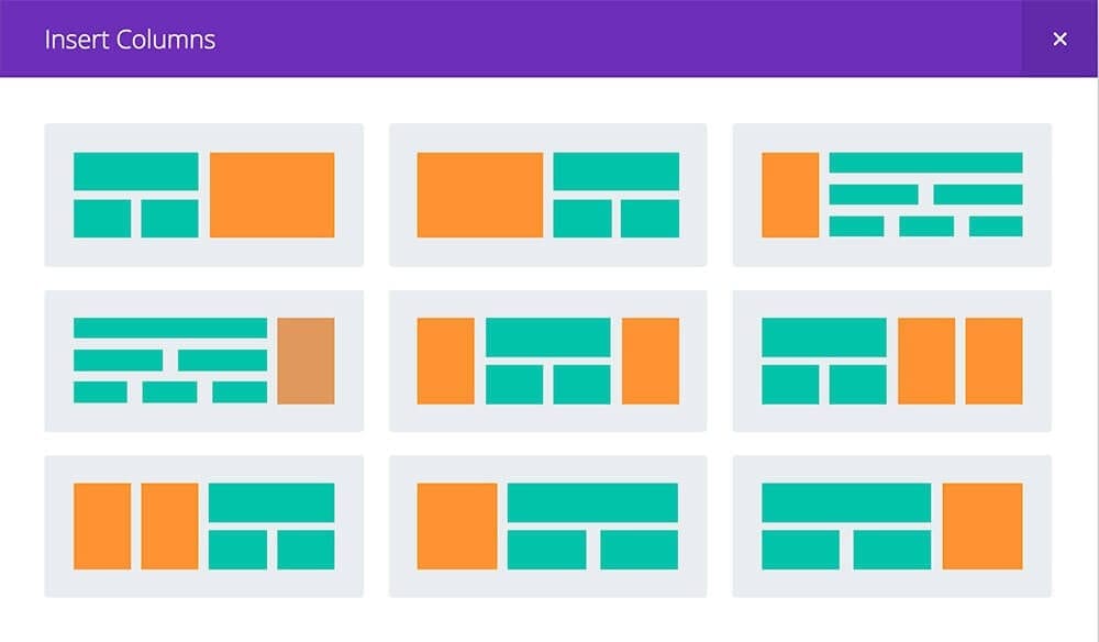
Infinite page layouts
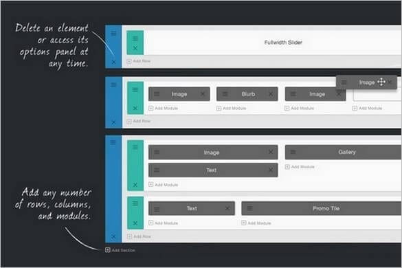
Drag and drop module based layouts using Divi
As well as providing benefits to the Acorns team in terms of control, the WordPress/Divi based solution also gave visitors an improved user-experience and provided us with some extra help that wasn’t available five years ago.
Multi agency approach
Teaming up with the marketing team at Acorns, along with other partners, the project was a great success. Wow Creative and 383 helped to drive the design of the site architecture and user experience. We helped to harness the very best in open source solutions to create a powerful content managed website for Acorns, with the design recognised using a bespoke (fully responsive) theme.
Improved SEO
Migrating the content from Joomla to WordPress was an integral part of the change and we took this opportunity to carry out a site-wide content and SEO audit. This involved carrying out detailed keyword analysis and on-page SEO to help bring about more traffic via improved search rankings, greater visibility and ultimately more leads/donations. What was most important, and was the common denominator which ran throughout the audit, was the need to provide a clear and consistent voice for Acorns and one that would reach out to the visitor and draw them in straight away.
The result
The end result was a fresh and distinctive design which would be instantly recognisable as Acorns, with clear messages and focus, and backed up with a powerful back end allowing Acorns to control the content and design in ways that weren’t possible before.
Here’s a direct comparison of how the website looked before the refresh and how it looks now, being displayed across a range of screens and devices.
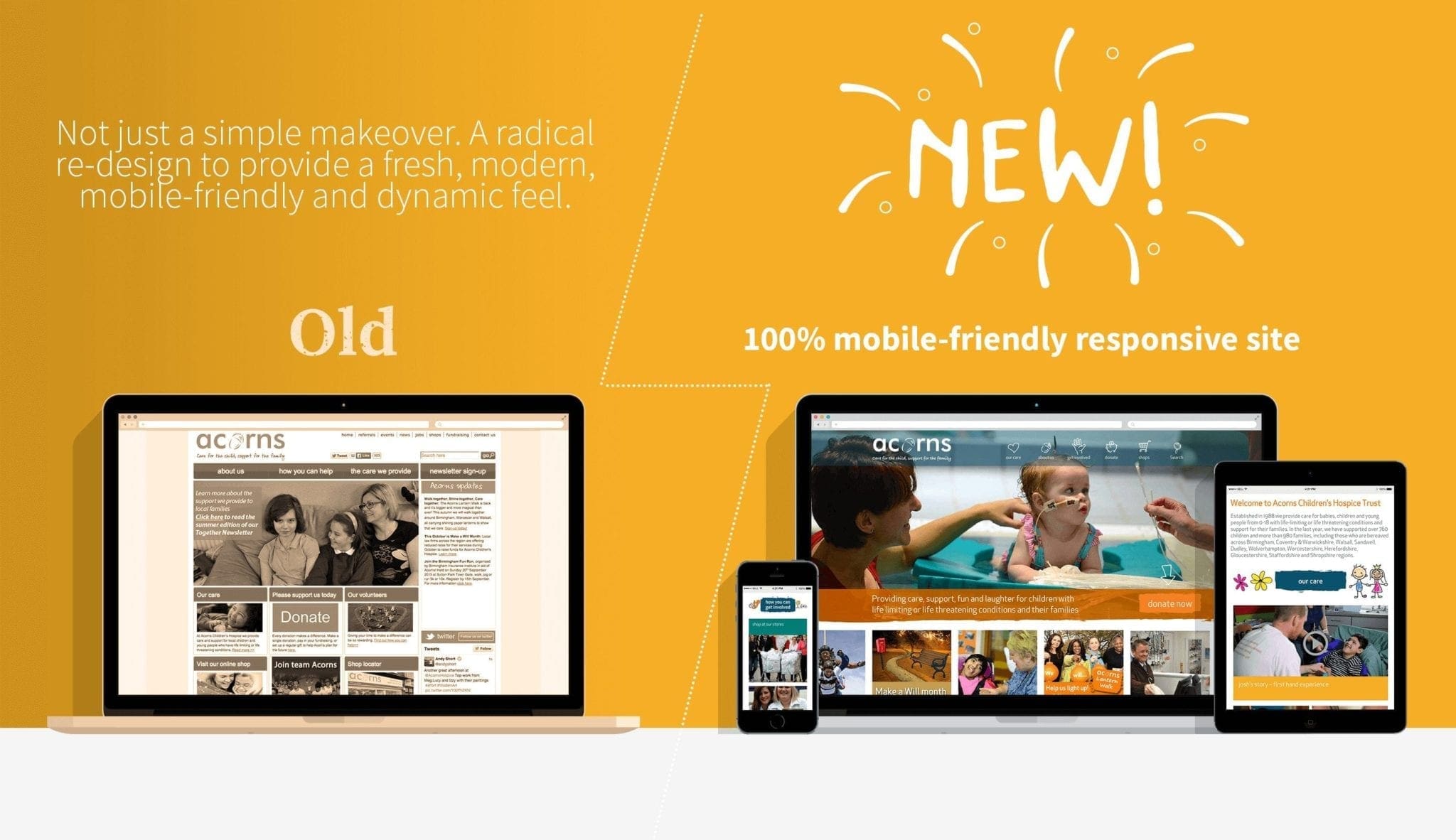
2010 to 2015 transition of the Acorns website
To see how we utilised the open source available to create a bespoke design which accurately addressed the needs of Acorns, it’s worth seeing some of the key pages:
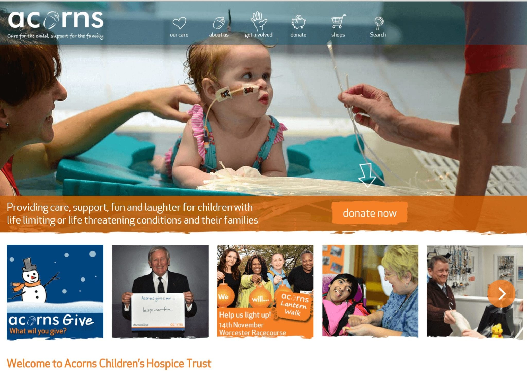
Acorns Children’s Hospice – new homepage design
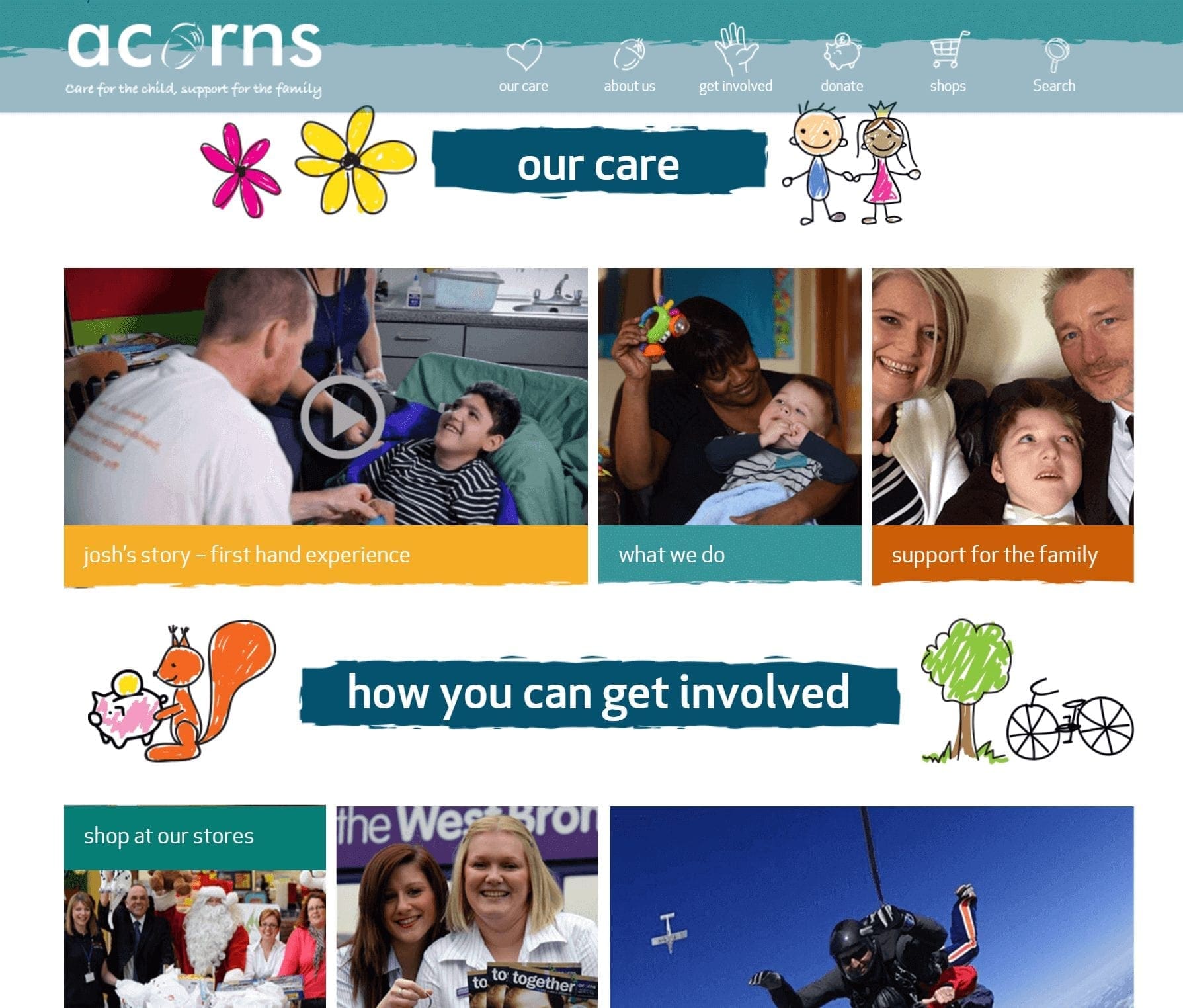
In keeping with the bold and visual design below the fold
The Our Care page:
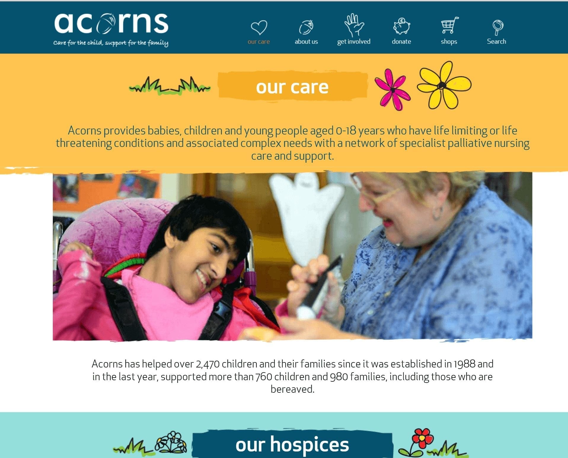
The new Our Care page for Acorns
As you can see from the above examples, the rebranding helped to establish a much fresher website with a design which was modern and easy to use, with a far more interactive emphasis. Having a mobile and tablet compatible site is a huge move forwards for Acorns, allowing all users to visit the site without it losing any of the effect.
Adam Borriello, Digital Marketing Officer at Acorns said:
“Throughout the project we developed a particularly close working relationship with Rob Bryan, Technical Director at Opace through which we were able to deliver a brilliant new site which will help us reach out to more people that can benefit from our services, and help those who fundraise for us to support our cause. Rob’s technical expertise, knowledge and proactive problem solving approach with our project team were crucial in helping us deliver our website vision in a realistic way during the build phase, that met the aims and objectives of what we wanted the site to do.
We are delighted with the end result and are looking forward to working with Opace in the future to continue the evolution and growth of our site.”
Everyone here at Opace has enjoyed working on the project with Acorns, with David Bryan, Managing Director describing the end result as a “triumph” and going on to say:
“Working with Acorns is always an absolute pleasure and we’re delighted to be able to create a fresh website design with quality content which we believe will deliver the results they need and allow them to build their brand more effectively in the future. We look forward to working with them again.”
For more information starting your own project with Opace give us a call on 0121 468 0600, we would love to provide a full lifecycle project for you in the way we did for Acorns.


