« Back to Glossary Index
Reading Time: 7 minutes -

5 Responsive Web Design Tips for Building a Mobile-Friendly Website

5 responsive web design tips for building a mobile friendly website

Responsive web design is good for SEO as well as user experience.

With mobile-first indexing prioritising responsive web design for SEO, now is the time to ensure your site is mobile-friendly. Since the beginning of 2017, mobile devices have accounted for around half of all web traffic worldwide and sites that don’t take this statistic into account ultimately pay the price with their SERP rankings. Not only that but, according to a survey undertaken by RedEye, 62% of companies that designed a website that was optimised for mobiles reported an increase in sales.

To help you get the best out of your responsive web design strategy, we’ve summarised the top five tips to help you build a mobile-friendly site. First of all, there are lots of ways to optimise your web design to make a site more responsive but, in our experience, these five are the most crucial, the easiest to implement and can make the most amount of difference when it comes to SEO and overall user experience.

Optimise Your Images

Always make sure that you compress images to ensure faster load times without reducing the resolution quality. In addition, the images for responsive web design should be optimally sized to prevent scaling, preserve quality and reduce bandwidth. It is best to use GIF. JPEG or PNG-8 formats to do this and never PNG; this format is notorious for ‘image bloating’.

Utilise the Viewport Meta Tag

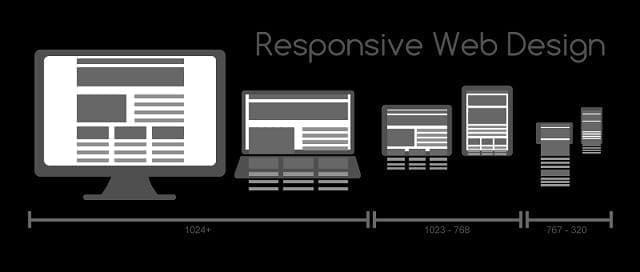
Responsive web design relies on building a site with a layout that adapts to suit the screen size that is being used to access it. This can only work if you enable the viewport meta tag.

A simple piece of code that needs to be added to the HTML on each page, it signals to browsers that they should fit the width of your page to the device’s screen.

Adding this code will make sure your pages are dynamically resized:

<meta name=”viewport” content=”width=device-width, initial-scale=1″>

Responsive web design tips

Responsive web design should make accessing your website intuitive for both mobile and desktop users.

Speed is of the Essence

Loading times are one of the main barriers to the success of responsive web design and can negatively affect user experience and have an impact on bounce rates.

As well as optimising your images for faster loading times (see above), make sure your site is not overloaded with an excess of unnecessary elements.

You can use services like Google Lighthouse to give you some insights into improvements you can make to speed up your site.

Go Big or Go Home

Accessing a website via a mobile device used to mean navigating fonts and buttons that were designed for desktop users and were notoriously difficult to access on smaller screens.

Responsive web design for mobile-friendly sites should mean that buttons are sized appropriately and that fonts are sized at least 14pts or larger.

Also, it is worth ensuring that your font choice is standard as any requirement to download a non-standard font is likely to result in a bounced session.

Order Off Menu

Responsive web design has seen an evolution in many components of the traditional layout of a website including the navigation menu.

With most mobile devices being used in a portrait orientation, the trend is now for hamburger menus which open up as side menu or overlay. Taking up far less screen space, this kind of navigation is less ‘fussy’ on screen and is more adaptive than a static menu.

Testing 1…2…3…

And finally, you should always make sure that any responsive web design changes you make to your site are tested. There is no greater approach to performing this task than actually pulling out your phone or tablet and actually browsing your own site.

Ask colleagues and employees to do the same across a range of device types and use their feedback to help you optimise your design.

A fresh pair of eyes is essential on design projects like this and you can even hire professionals to test your site for you.
Responsive web design tips for building a mobile friendly website

Responsive web design is essential in a world of mobile-first indexing.

Opace and Responsive Web Design

Opace is a multi-disciplined responsive web design agency that offers its customers the benefits of high customer retention rates, improved user experience and enhanced SEO and marketing. Not only that but our designs future-proof your website and give your online business a competitive edge.

To find out more about our web design services including bespoke sites and open source solutions, contact us today.


Image credits: Templune/Pixabay, MRafizeldi/Wikimedia and Pixnio.


« Back to Glossary Index